Problem
Shoppers are looking for a way to find unique pieces that will fit into their lives. While finding a product’s build and statistics is easy finding out about a used pieces history is more difficult if they aren’t being purchased in person.
Solution
The new site focuses on putting the information the customers are looking for front and center while giving them a way to search beyond make and model by showcasing pieces in artboards based on different styles and preferences.
This conceptual design was done for a local furniture retailer that sells original, consignment and mass-produced pieces.
the goal was to create a new site design and e-commerce layout that allowed the company to present limited quantity items and larger quantity pieces with the information that shoppers were most interested to learn.
Tools used:
Google Forms
Sketch
Invision
Zeplin
Step 1: Research
Empathize and Define
I started my research by looking at the competitors, both online and with brick and mortar stores. This analysis included large scale competitors as well as smaller local competitors. This helped me identify best practices and common design elements for the industry.
To understand the user who is searching for consignment or original pieces I used two tools. A google form for a survey and interviews with two shoppers who were at a local consignment shop. Using responses from both I conducted an affinity mapping exercise to find trends. From these, I was able to create two personas who would buy at this store for their furniture needs.
Interviews
Survey Responses
The Personas


Frank Jones
The style guide
Age: 62
The Story:
Frank is the CEO of a midsized company who enjoys decorating his home with unique and original designs. He enjoys original and unique art and finds himself perusing galleries and showrooms. He enjoys hosting unique events and often has family and visitors in town.
“I’m interested in consignment and used furniture because it has a story. Its unique unlike what I can buy from Amazon or Ikea.”

Kelley Adams
The thrifty shopper
Age: 29
The Story:
Kelley is a middle school teacher who enjoys DIY and making unique projects out of everyday items. She doesn’t like to over decorate their house, however, she has recently found that she and her boyfriend’s house doesn’t have enough seating for the get-togethers they like to throw.
“Our house is always packed with people, but I’m never sure if furniture will fit. In addition, I’m trying to be smarter with my money because of mortgage payments.”
Step 2: Ideation
Mapping and Wireframing
After these had been compiled I started the initial wireframes for the necessary screens, starting with a low-fidelity wireframe.
Step 3: Prototyping and Testing
Paper tests, prototypes, and improved fidelity
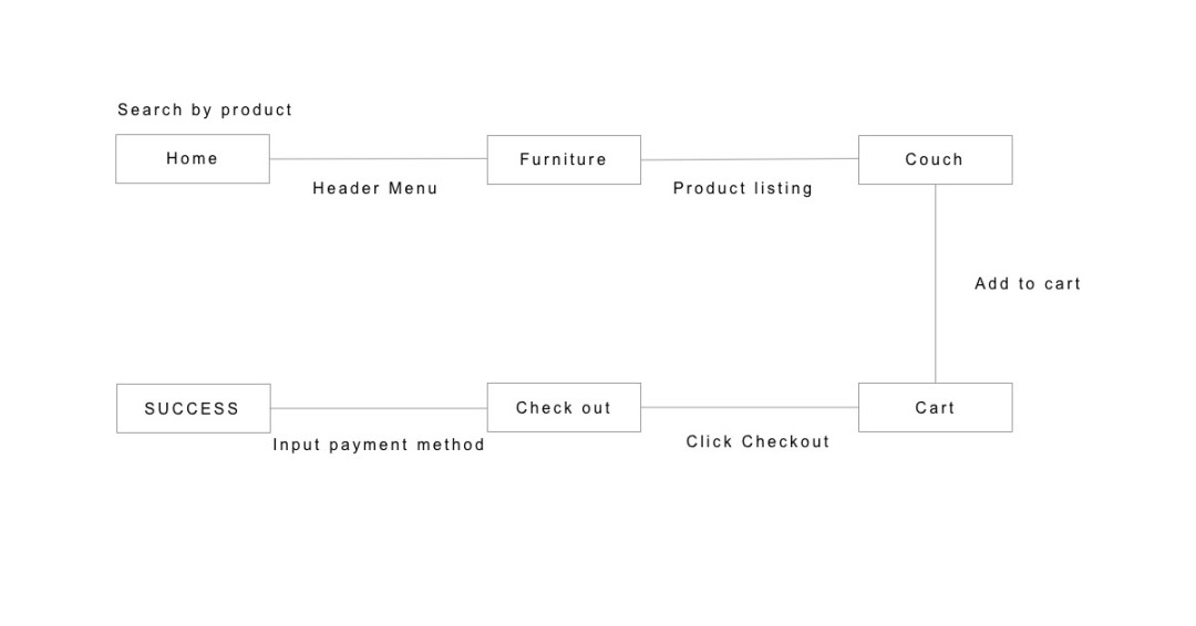
Using these lower fidelity wireframes I ran some initial user testing to see if the flow made sense to potential users. Once this testing was complete I raised the fidelity of these wireframes to a mid-level and commenced with further testing with a prototype created in Invision. To see these click the links below. Wireframes and mockups can be seen at the bottom of the page.
Known Needs flow
Style flow
Step 4: Wireframes and High-fidelity Mockups
low and mid-fidelity wireframes and mockups
Modmoods current site is not designed with e-commerce in mind. The main focus is on information, With a categorization system that is provided in industry lingo. This meant that in designing the new UI and layout I needed to look at not only what was visually appealing, but what was understandable for the layman users. I went with a minimalist design, utilizing shades of grey, blue and white to offset their logo’s red highlight.
In addition to bringing the desktop site through the design process, from lo-fi wireframe to mockup, I also converted pages to responsive web design for mobile devices.
Deliverables and Next Steps
In addition to creating the personas, sitemap, user flows, wireframes, and mockups, I used Zeplin to create a style guide that could be used for delivery to a development team, or for future designer usage.


